
Hiding passwords when you enter is used for a long time, and it is often used in the forms of registration and authorization. This allows you to not disclose your password to strangers, who are behind. Although hiding passwords is a good technique, created for the safety of the user, but there is a possibility, that it can spoil the user’s impression of your registration form. When users click on the register button, they expect to see unpleasant, simple registration form. But that, how did you decide to enter your password, may disappoint them all over the site.
This article expresses the personal opinion of the author and touches on experimental UX techniques., which are not the only correct. Do you agree with the proposed options? Can you suggest the best solutions?? You can share your opinion or suggest your solution in the comments.
Suitable for authorization, not suitable for registration
Authorization is used much more often., than the registration form. Users only need to register on the site once., to create an account, at the same time, he will have to enter the site to access the account many times. Because of, that login forms are used so often, high probability, that users will have to enter a password in front of other people. Sometimes users just want to show something to their friends or colleagues, in this case, they will have to enter the site, probably at this time someone will already be nearby. Therefore, it makes sense to use hidden passwords in login forms.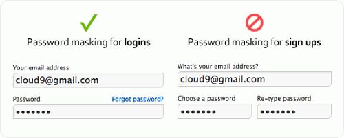
However, the reasons and consequences of hiding the password in the registration form are completely different. Hiding a password usually leads to typos, because the user does not see, what is he gaining, and cannot pinpoint, where did you make a mistake. The consequences of a typo in a password during authorization are not so serious, as when registering a new user. If the user is unable to dial the correct password the first time, he just tries to enter it again. If he enters the wrong password during registration, he will not be able to log in, and he will have to reset his password. Such errors are not the user's fault.. It's the designer’s fault, which did not give the user the opportunity to see, what he entered in the password field.
But what if we remove the password confirmation field?
One of the biggest obstacles to the user in the registration process, which creates a password hiding - this is a field for password confirmation, which is often used in registration forms. This field forces the user to type the password again and checks, that the values of these two fields are the same, reducing the chance of a password error. The reason for the existence of this field is sometimes users, entering the password in the field with hidden content, make typos, and this additional field can weed out these errors.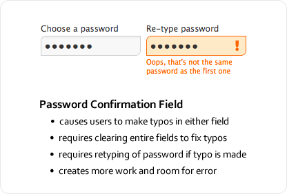
Password confirmation field can be added for good purpose., but they have one drawback. Users tend to make even more typos, entering the password in two different fields. Moreover, they will have to do extra work, to fix these errors. Because of, what they do not see, where were sealed, they will have to clear the contents of both fields and re-enter the password at least once. Thus, password confirmation field not only causes more typos, but also forces the user to do certain work, to fix them, slowing it down and making the registration process unpleasant.
Translator's Note. The password confirmation field has already begun to be removed by some large sites, example - twitter.com. Also, for CIS countries there is another problem - the presence of several keyboard layouts, as a result, the user can enter the same password twice in the wrong layout, in which he suggests. So in this case, the benefits of this field are even less.
Temporary display of password reduces the number of typos
Hiding a password can add more problems to the user., what good. They hide not only the password, but also typos, made by user, making them hard to spot and fix. Safety, which such a solution offers, not worth it, because usually visitors are registered on the site, being alone, when no one looks over their shoulder. Registration is done only once, after which they will not have to register again. Display password in plain text this one time, when they are alone, probably, not so serious risk to their safety, how we used to think. Chances of that, that someone will spy the password is practically null, even if the user is registered in a public place.
The solution to all these problems is to temporarily show the password., so that the user can enter it quickly and carefully, eg, show password a couple of seconds, so that he can see, what introduced. Temporary display of the password reduces the number of typos and simplifies the search and correction of errors. And the user does not have to worry about those, who is behind him, since the password is hidden very quickly, eg, only the last two characters entered are displayed. Curious people will have to remember the set (hope) random characters in a few seconds, which is almost impossible to do. If we show only the last characters, they will have to look at the screen for a longer period of time, to see the whole password.
I truly believe, that spies, spying passwords is just paranoia. The biggest problem is that users lose access to their account due to password errors during registration, caused by a hidden field to enter it. Next, I want to suggest two methods.
Password display, when the field is in focus
You can make password entry easier to fill out and safe at the same time., displaying the password only when the field is in focus, and hiding its contents when switching to the next field. This will allow the user to see, what characters does he enter at the moment, thereby reducing the risk of typos and prevents the curious from stealing a password, when the user moved on to the next.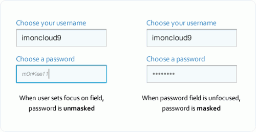
Other improvement, which you can add - show user password in small, light gray italic letters. As a result, to parse each character, will need to get closer to the screen. Even if someone tries to pry the password, he will look too illegible for everyone, except visitor, sitting right in front of the screen.
Another option is to show only the last characters entered, replacing the rest with asterisks, thus confirming the password.
Password check box
Another option is to add a checkbox to display the password.. In this case, when user enters password, he is hidden, but if they tick, it is displayed, letting them see, did they make a mistake. To implement this technique will require more effort, but it is much better, than password confirmation field, because this option allows the user to easily see and correct mistakes made.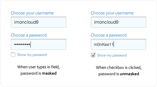
Prim. translator. In this case, we give the user the opportunity to make a decision., show password or hide it depending on the place and environment.
The balance between security and experience
It is generally recommended to follow generally accepted design decisions., but when such a decision slows down the user, complicates the task or increases the likelihood of error, it requires serious consideration. Safety must be balanced with experience.. Preferring security too much, you can leave an unpleasant impression of using your resource. When will you find the "middle ground", users will not have problems using your website, even if he does not follow generally accepted design decisions.